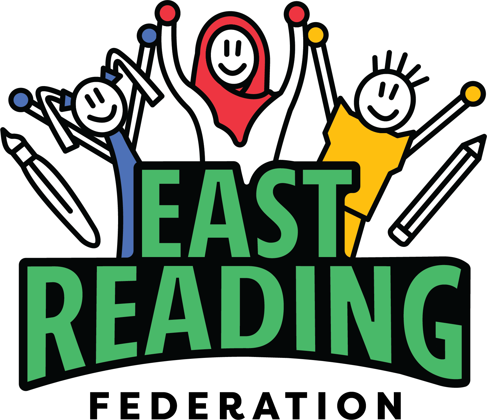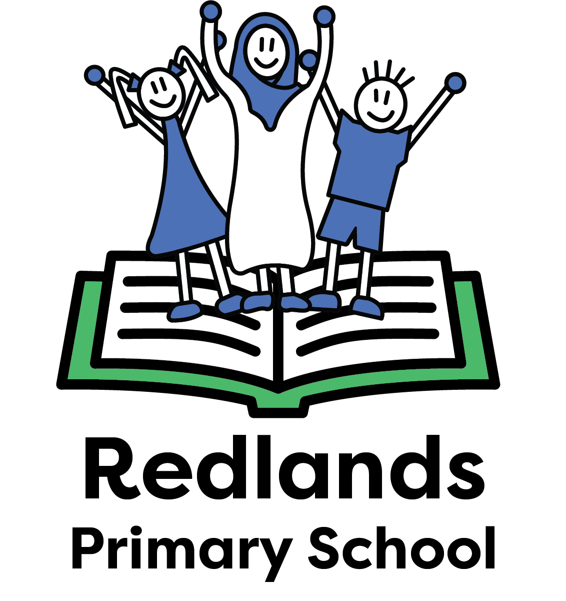
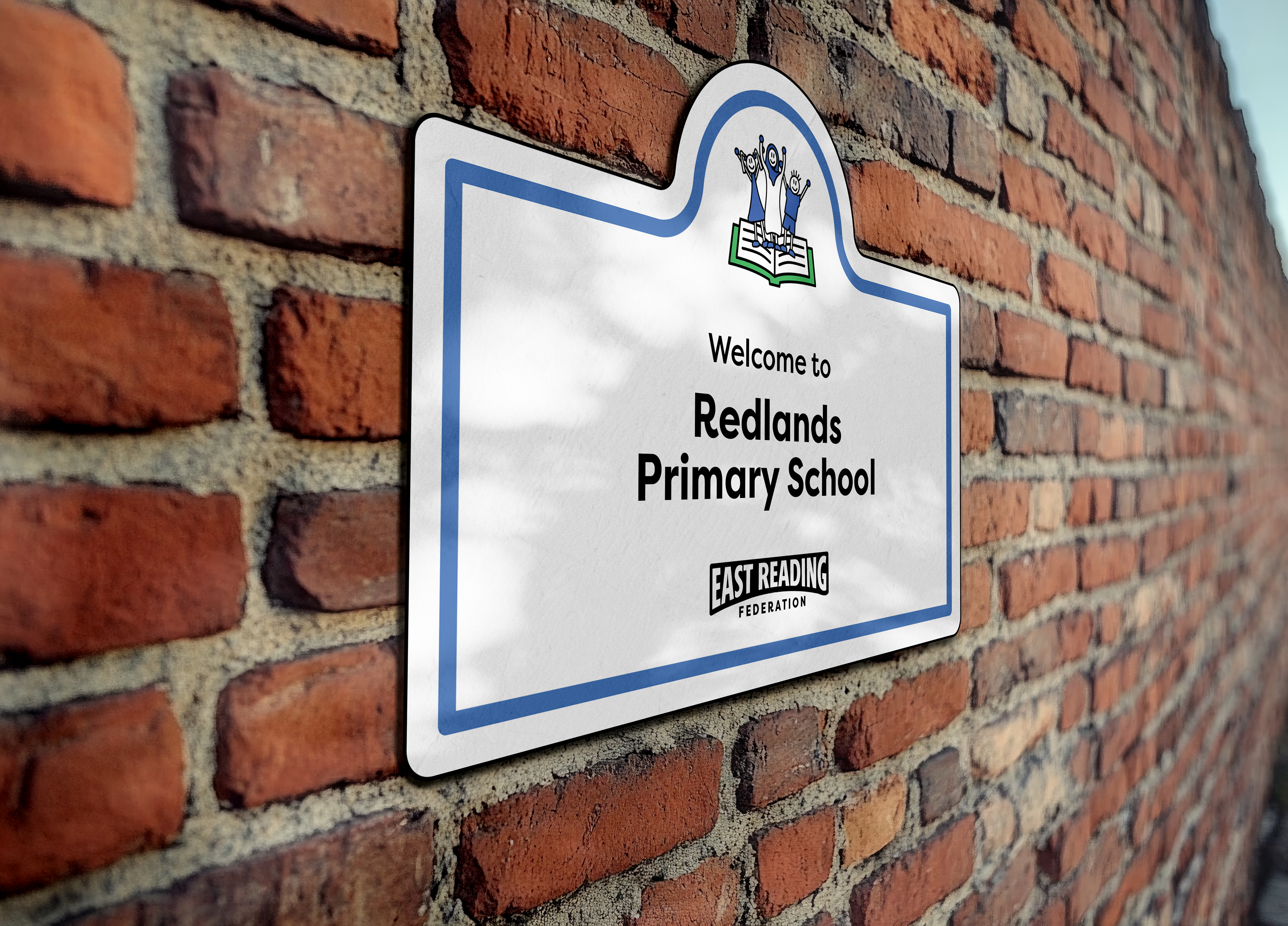
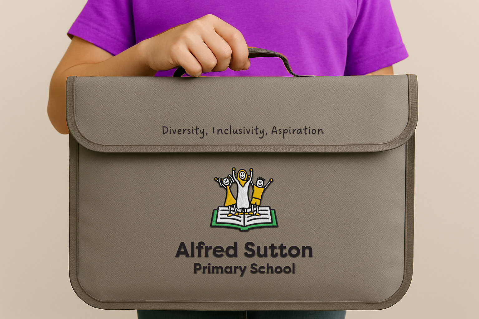
East Reading Federation is a partnership between two primary schools located in East Reading: Redlands Primary School and Alfred Sutton Primary School. They are in the same catchment area and aim to unite the two schools together to improve education outcome, become schools of choice and to make working for both schools rewarding for staff. East Reading Federation is inclusive, aspirational, and supportive. Understanding their commitment to diversity, excellence and collaboration is how we began to create the assets for this project.
The aim was to create a logo which represents community, aspiration and diversity and inclusion. The bridge shape of the federation name reflects the union of the two schools. Diversity and inclusion is shown through the different colours of the childrens clothes and through gender and culture. Aspiration is shown through the pencil and paintbrush icons that indicate creativity and progress. The logo is a clear reflection of the federation’s values, whilst maintaining school individualism through the use of their school colours. We chose Filson Pro as a typeface for the brand due to its primary school 'look and feel' as seen in some of the letters like the capital 'R' and lowercase 'f'.
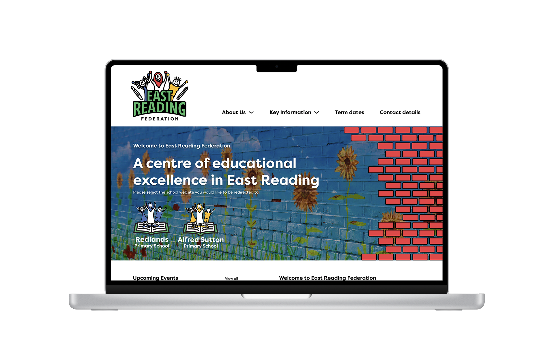
The outcomes of this project were the product of team work through good use of time management and understanding of skills, as team leader I ensured that each member of the team was able to create assets that helped strengthen their design skills while contributing to the project. The client was thrilled with the outcome and the assets are beginning to be implemented into the schools.